
Inspector
The Inspector shows and edits the selected node — its name, its transform, and its components. Selecting a node in the Outliner or the viewport shows it here.
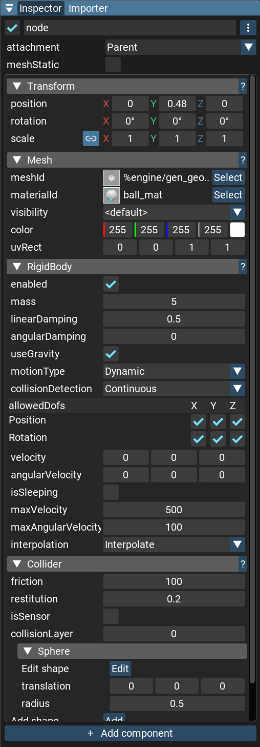
Node header
At the top of the panel:
A checkbox toggles the node’s active state.
The node name is editable inline.
The ⋮ button opens a menu with Expand all / Collapse all (for the component headers) and Open new Inspector, which opens the node in a second inspector window. Up to four inspector windows can be open at once.
Attachment — how the node follows its parent (its attachment mode).
meshStatic — for a node with a mesh or LOD selector, marks its meshes as static; a mixed state is shown when a node and its children differ.
When the node is a prefab instance, an Open prefab source button appears below the header to open that prefab for editing.
Transform
Every node has a Transform section with Position, Rotation (Euler angles, in degrees), and Scale. The scale field has a lock button that constrains proportions, so editing one axis scales the others to match.
Right-clicking the Transform header offers: copy or paste the position, rotation, scale, or the whole transform; reset any of them; Show World Transform (adds read-only world-space rows); and Paste new component, which pastes a copied component onto the node. The ? button opens the scene documentation.
Components
Each component on the node is a collapsing header below the transform. Its ? button opens that component’s page in the Components reference.
Right-clicking a component header offers:
Copy component, Paste component values (paste onto the same component type) and Paste new component.
Cut component and Delete component. These are disabled when another component on the node requires this one; the tooltip names the dependent.
To copy a component to another node, choose Copy component, then on the target node press
Ctrl+V or right-click the empty area below the components and choose Paste new component. If
the target node already has that component, the copied values are applied to the existing one
instead.
Most components show their fields with the generic field editors below. Some add custom controls or visualizations — for example the Collider shape editor, the UIAnchor anchor grid, or the limit and curve controls on the physics joints. Each is described on the component’s own page.
Field editors
A component’s fields are edited with a widget chosen from the field type. What each field of a given component means is documented on that component’s page; the widgets are:
bool — a checkbox.
int / float — a drag input.
vector — a drag input per component.
enum — a dropdown.
bitfield — a dropdown of checkboxes (any combination of flags).
string — a single-line box, or a collapsible multi-line box.
color — a color picker.
NodeId — a node picker; you can also drag a node from the Outliner onto it.
resource id (mesh, texture, material, font, sound, prefab, model, and so on) — a resource picker; you can also drag the asset from the Project panel onto it.
array — indexed rows you can reorder by dragging, with + / - to add and remove.
table — key/value rows, with + / - to add and remove.
struct — a nested, collapsible group of fields.
variant — a type selector plus the value of the chosen type.
Which widget a field uses, its label, range, and tooltip can be tuned with field annotations — see Fields annotations.
Adding components
The Add Component button at the bottom opens a searchable, categorized list of every native and user component. A component already on the node is greyed out — except Collider, which is offered as separate shapes (Box, Sphere, Capsule, Cylinder, Mesh) and can be added more than once.