UI Basics
Note
The UI system is still evolving, but you can already build a complete UI for your game with it today.
UI is built from scene nodes: an element is a node with UI components attached (UIText, UIImage, UIButton, …), and the node hierarchy is the UI hierarchy — children are positioned relative to parents and drawn on top of them. Two requirements:
the root of a UI tree is a node with a UICanvas component;
a
Cameramust exist in the scene.
Per-component reference: UICanvas, UIFrame, UIImage and the other UI* pages.
UIFrame
Every UI element has a UIFrame — the element’s geometry. Layouts, anchors and input hit-testing operate on it. Any UI component adds it automatically; add it manually only on empty container nodes.
size : float2— width and height in canvas pixels.pivot : float2— the frame’s origin inside its own content:(0, 0)top-left,(1, 1)bottom-right. Default(0.5, 0.5).localPosition2D : float2— position of the pivot point relative to the parent frame’s top-left corner. +Y points down (3DlocalPositionhas +Y up).

The pivot is the node’s origin: localPosition2D places it, scale and rotation are applied around it.

Component lookups are not free — get the component once and reuse it:
var frame = node?.UIFrame
frame.size = float2(200., 60.)
frame.pivot = float2(0., 0.5)
frame.localPosition2D = float2(40., 120.)
Tip
Use the pivot to control which point of an element stays in place. A health bar with pivot = float2(0, 0.5) keeps its left edge fixed while size.x shrinks — the bar “drains” to the left.
Warning
Layouts and UIAnchor own the positions of their nodes — manually set localPosition2D values are overwritten.
UIMask
UIMask clips child UI elements to the area covered by the node’s own UIImage (required, added automatically).

Note
A mask hides everything attached below it as child nodes — the entire subtree is clipped, including nested children and their UI components.
The mask follows the visible pixels of the image: fully transparent texels are cut out — a shaped texture (circle, rounded rect) gives a shaped mask.
The mask is binary: semi-transparent pixels mask like opaque ones, the edge is always hard.
fillMode/fillAmountof the image shrink the mask area.Mouse input outside the mask frame is blocked for children.
Masks can be nested.
enabled— toggles clipping;showMaskSource— whether the mask’s own image is drawn (false= invisible, defines the area only).
Typical tasks: scroll lists (UIScrollArea uses a mask for its view area), round minimaps (circle texture), portraits, reveal/wipe effects (animate the mask’s frame size).
UICanvas and screen modes
UICanvas is the root of a UI tree. You design the UI at a fixed reference resolution — the canvas UIFrame.size — and screenMode defines what happens when the real screen differs:

ScreenMode.FitExtend(default)Uniform scale to fit, then the canvas is extended along the remaining axis to cover the whole screen. The simplest mode: children need no extra scaling, no empty bars. On wider/taller screens the canvas becomes larger than the reference — pin elements with
UIAnchor, not hard-coded positions.ScreenMode.FitUniform scale, the canvas keeps exactly the reference size — the UI stays centered, unused screen space is left at the sides. Use when the UI must keep an exact aspect ratio (fixed playfield of a board/puzzle game).
ScreenMode.FullscreenCanvas size = physical screen resolution, no scaling: one canvas unit = one screen pixel. You must scale child nodes yourself for proportional display on different monitors and resolutions. For resolution-aware UI (editors, debug overlays).
ScreenMode.CustomThe engine doesn’t touch the canvas — size, position and scale are yours.
Tip
Start with FitExtend plus UIAnchor for pinning to the screen edges — the simplest setup: no extra scaling of child nodes, works on any resolution. Use Fit if the UI must stay centered at an exact aspect ratio.
The mode and the reference resolution are set on the canvas node:
add_component(canvas, new UICanvas(screenMode = ScreenMode.FitExtend))
canvas?.UIFrame.size = float2(1920., 1080.)  // reference resolution
Note
For Fit/FitExtend the canvas size at game start is remembered as the reference resolution — set it during initialization, before the first frame.
renderMode is ScreenSpaceOverlay by default; ScreenSpaceCamera and WorldSpace are work in progress.
Layouts
Layout components arrange the children of their node automatically:

UIHorizontalLayout — row.
UIVerticalLayout — column.
UIFlowLayout — row/column (
direction) with wrapping — inventories, grids, tag lists.
Tip
Prefer layouts for arranging elements inside panels — less code than manual positioning or per-element anchors, and the UI reflows automatically when children are added, removed or toggled.
Common settings: spacing — gap between children; padding — insets from container edges, (left, top, right, bottom); alignment — where the packed children sit in the frame, TopLeft … BottomRight:
add_component(bar, new UIHorizontalLayout(
    spacing = 10.,
    padding = float4(10., 10., 10., 10.),
    alignment = LayoutAlignment.MiddleCenter
))
Facts:
The layout owns and overwrites children’s
localPosition2D. To move an element — reorder children or change spacing, don’t set positions.Only children with a
UIFrameparticipate; the layout packs their ownsize. A child container without a size collapses to zero.Inactive children are skipped — toggling
isActivereflows the rest.The layout node itself needs a sized
UIFrame(or UIContentSizeFitter to size it from content).Layouts nest: vertical layout children can be horizontal layouts — menus, settings screens, HUD bars.
Warning
A layout and a UIAnchor on its child drive the same properties (localPosition2D, size) — combined, they conflict.
childForceExpand flags (horizontal shown; vertical mirrors the axes):

UIAnchor
UIAnchor positions (and optionally resizes) a frame relative to its direct parent’s frame — typically the canvas. Score in a corner, top bar across the screen — on any resolution.
anchorMin/anchorMax — anchor points in the parent’s normalized space ((0,0) top-left, (1,1) bottom-right); left/top/right/bottom — pixel insets. Per axis:

- Point anchor (
anchorMin == anchorMaxon the axis) Size is kept; the frame’s pivot is placed at anchor +
left/topinset (right/bottomignored):score?.UIFrame.pivot = float2(1., 0.) // align by the top-right corner add_component(score, new UIAnchor( anchorMin = TOP_RIGHT_ANCHOR, anchorMax = TOP_RIGHT_ANCHOR, left = -20., // 20 px from the right edge top = 20. ))
- Stretch (
anchorMin != anchorMaxon the axis) The frame is resized so its edges sit at the anchors offset by the insets; its own size on that axis is ignored:
// Top bar: full width, 10 px margins
add_component(topBar, new UIAnchor(
    anchorMin = float2(0., 0.),
    anchorMax = float2(1., 0.),
    left = 10., right = 10., top = 10.
))
Stretch on both axes (
TOP_LEFT_ANCHOR→BOTTOM_RIGHT_ANCHOR) = parent’s rect minus insets: fullscreen overlays, inner content areas.
Warning
With a point anchor the frame’s pivot lands on the anchor point. Set the pivot to the matching corner (pivot = float2(1, 0) for a top-right anchor) — otherwise the element hangs half off-screen.
Constants: TOP_LEFT_ANCHOR, TOP_CENTER_ANCHOR, TOP_RIGHT_ANCHOR, MIDDLE_LEFT_ANCHOR, MIDDLE_CENTER_ANCHOR, MIDDLE_RIGHT_ANCHOR, BOTTOM_LEFT_ANCHOR, BOTTOM_CENTER_ANCHOR, BOTTOM_RIGHT_ANCHOR.
Anchoring overrides localPosition2D and, on stretched axes, size.
Editing anchors in the inspector
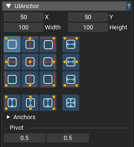
The preset matrix sets the anchor: columns — left / center / right / horizontal stretch; rows — top / middle / bottom / vertical stretch; the corner cell stretches both axes.
Click changes only the anchor (insets are kept, the node may shift). Alt+click also aligns the node to the anchor.
Fields are named by mode:
X/Y+Width/Heightfor a point anchor (width/height edit the frame size),Left/RightandTop/Bottominsets when the axis is stretched.The
Anchorsfoldout exposes the rawanchorMin/anchorMaxvalues.
Tip
When a node has an anchor, edit the pivot in the UIAnchor section — the insets are recalculated so the node stays in place. The UIFrame pivot field doesn’t update the insets, and the anchor will shift the node.
Layouts or anchors?
Anchors at the top level — direct children of the canvas (HUD corners, bars, popups) follow the real screen edges in any resolution.
Layouts everywhere inside — rows of buttons, lists, grids. When in doubt, reach for a layout first: less code, and it survives content changes.
Layouts and anchors drive the same properties (
localPosition2D,size) — on a layout’s child they conflict, so pick one per node.
A typical HUD hierarchy:
UICanvas (FitExtend, reference 1920×1080)
├── top_bar          UIFrame + UIAnchor(stretch top) + UIHorizontalLayout
│   ├── score        UIFrame(fixed size) + UIText
│   └── timer        UIFrame(fixed size) + UIText
├── minimap          UIFrame + UIAnchor(point, bottom-right) + UIImage + UIMask
└── pause_menu       UIFrame + UIAnchor(point, center) + UIVerticalLayout
    ├── btn_resume   UIImage + UIButton
    └── btn_quit     UIImage + UIButton
Where to go next
Open the UI demos from the launcher’s Samples section — UI components (every component from this page and more in one scene), UI Layouts (layouts in action), UI sample (components with custom textures) — and tweak them in the editor.
This page covers the core; the
UI*reference pages document every property, plus the components not covered here: UIText, sliders, checkboxes, text input, dropdowns, scroll areas.Everything here can also be built and driven from code — and fast_ui ships a pile of useful wrappers (
canvas(),hbox(),vbox(),button(),text(), …) that make it a few lines per screen.